Website and Web Application Anatomy
Learn navbars, heroes, CTAs, sections, cards, sidebars, forms, modals, states, and responsive layouts for precise UI prompts.
Table of contents
Knowing UI names makes communication with designers, developers, and coding agents more precise. Replace "make a good website" with instructions that identify hierarchy, layout, behavior, states, and supported devices.
1. From the Browser to Components
A website is a collection of pages available through a domain. A web page is one page or route. A web application has interactive behavior and state such as accounts, forms, dashboards, or transactions. A component is a reusable UI part such as a button, card, navbar, or dialog.
The viewport is the visible browser area. The fold is its lower boundary before scrolling. Above the fold describes what appears first. Not everything important belongs there, but page identity, primary value, and the next action should be easy to find.
2. Page Shell, Header, and Navigation
A page shell or app shell is the frame that remains consistent across pages. It usually contains the header, navigation, main content, and footer. A signed-in application may add a sidebar and top bar.
| Term | Purpose |
|---|---|
| Header | Top area containing identity and navigation |
| Navbar | Primary navigation between pages |
| Top bar or app bar | Application controls such as search and a user menu |
| Announcement bar | Temporary information above the header |
| Logo | Brand identity, commonly linked to home |
| Primary navigation | Main paths to important areas |
| Secondary navigation | Additional paths inside one area |
| Breadcrumb | Current page position in a hierarchy |
On smartphones, a navbar often becomes a menu or drawer. Do not hide links without providing an accessible replacement for keyboard and screen-reader users.
3. Hero and Call to Action
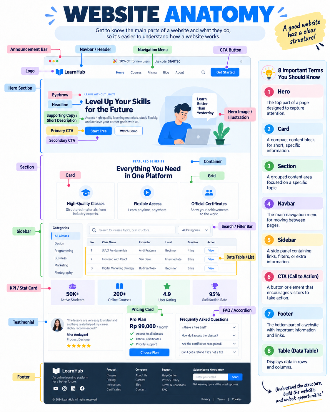
A hero is the main opening area of a landing page. Common parts include an optional eyebrow, headline, supporting copy, primary CTA, secondary CTA, and a relevant visual.
A CTA, or call to action, encourages an action such as "Start free", "View demo", or "Download Project ZIP". The primary CTA is the most important action. A secondary CTA offers an alternative. Too many actions with equal weight make the priority unclear.
A hero is not just any large banner. It should explain the purpose of the page and help a visitor choose the next step.
4. Sections, Containers, Grids, and Spacing
A section groups content around one topic. A container limits width and preserves alignment. A grid arranges columns and rows. A stack places elements vertically or horizontally with a consistent gap.
Whitespace is not wasted space. It supports hierarchy and readability. Spacing should follow a system instead of random values per component. Responsive layout changes columns, order, size, or navigation according to available room. It does more than shrink a desktop page.
5. Cards, KPIs, Lists, and Tables
A card groups concise content around one context. A KPI or stat card highlights a metric. A list suits ordered or repeated items. A grid supports visual scanning. A table supports comparison across columns.
A data table can add sorting, filters, pagination, row selection, and actions. On mobile, define priority columns, deliberate horizontal scrolling, or an alternative detail view. Do not convert every table into cards without considering the need to compare data.
6. Sidebars, Tabs, and Disclosure
A sidebar is a side panel for navigation, filters, or extra context. It often becomes a drawer on mobile. Tabs switch between panels in the same context. They should not replace navigation between pages that need their own URLs.
An accordion expands one or more sections. A dropdown menu lists actions or destinations. A tooltip gives a very short explanation on hover or focus. A popover contains richer interactive content. Use a modal only when a person must finish or cancel a focused task before returning.
7. Forms and Feedback
A form combines labels, inputs, helper text, validation, error messages, and actions. Never use a placeholder as the only label. Explain input format and place an error near the affected field.
| Feedback | Appropriate use |
|---|---|
| Inline error | Problem with one field |
| Banner or alert | Important page-level condition |
| Toast or snackbar | Brief confirmation after an action |
| Modal or dialog | A decision requiring focused attention |
| Empty state | No data exists and the user needs a next action |
| Skeleton | The final structure is loading |
A success state should explain what succeeded and what happens next. An error state should offer a recovery path instead of only saying that something went wrong.
8. Modals, Drawers, and Overlays
A modal or dialog appears over a page and traps focus for one task. A drawer or sheet enters from a screen edge and suits mobile navigation, filters, or contextual detail. A popover stays attached to its trigger and fits short choices.
Every overlay needs a close action, Escape handling, focus management, clear backdrop behavior, and an accessible label. Avoid opening a modal over another modal unless the flow cannot be simplified.
9. States and Permissions
Think through these states for each data-driven component:
- initial and loading;
- empty;
- populated;
- partial or stale;
- validation error;
- server error;
- success;
- disabled;
- unauthenticated;
- permission-limited.
Permission is more than hiding a button. The server must still verify authorization. UI helps a person understand available actions, while the backend decides whether an operation is allowed.
10. Responsive Design and Accessibility
Test narrow smartphones, tablets, laptops, and wide screens. Inspect headline wrapping, table overflow, touch targets, image crops, sticky elements, keyboard order, and focus rings. Use semantic elements such as header, nav, main, section, button, and footer according to their meaning.
Informative images need text alternatives. Test contrast, zoom, reduced motion, form labels, and keyboard use. Accessibility is not a final addition after visual work.
11. Common Page Anatomy
Landing page: header, hero, benefits or features, social proof, testimonial, pricing when relevant, FAQ, final CTA, and footer.
Dashboard: app shell, sidebar, top bar, page header, KPIs, filters, chart or table, detail drawer, and empty/loading/error states.
Authentication page: brand, heading, form, validation, alternative sign-in, recovery link, legal notice, and security feedback.
List page: page header, search/filter/sort, result count, list or table, pagination, relevant bulk actions, and empty/error states.
12. A More Precise UI Prompt
Build an authenticated dashboard with existing components and design tokens.

Desktop layout:
- persistent left sidebar;
- top bar with page title, search, and user menu;
- four KPI cards;
- filter bar above a data table;
- record detail opens in a right drawer.

Mobile:
- sidebar becomes a drawer;
- KPIs move to two columns, then one on narrow screens;
- table preserves priority columns and opens row detail.

States:
- loading skeleton;
- empty state with CTA;
- populated;
- validation error;
- server error;
- permission-limited.

Do not invent navigation items or copy branding from the screenshot.
Continue with Designing Better Frontends with AI to create a DESIGN.md, asset inventory, and visual QA process.
13. Screenshot Reading Checklist
- What page type is this and what is its primary goal?
- What is the hierarchy from headline to action?
- Which areas are the shell, sections, containers, grids, and components?
- Which navigation is primary and secondary?
- Which states are shown or missing?
- How should layout change on mobile?
- Which assets are references and which may ship?
- Which behaviors cannot be inferred from an image alone?
Official sources and references
Use these sources to confirm current commands, capabilities, prices, and limits.
Was this guide helpful?
Tell us whether the steps worked or if something needs an update.